
A spectrogram is a time-frequency picture of sound: time runs left to right, frequency runs bottom to top, and colour or brightness shows loudness at each point. Learning to read one lets you spot vowel formants, hiss and hum, clicks, and the harsh texture of fricatives at a glance. But a glance is never the whole story; you always want to cross-check what you see against what you hear.
TL;DR:
- Setting a frequency ceiling around 8,000 Hz helps focus on speech sounds and reduces visual clutter for clearer formant analysis.
- Recognising basic patterns such as horizontal lines for harmonic stacks or broadband noise for fricatives allows quick identification of sounds like vowels, consonants, and electrical hum.
- Proper interpretation requires cross-checking spectrogram observations with listening, waveform inspection, and pattern repetition across multiple segments.
- Spectrogram settings, especially window size, should be chosen based on the analysis goal, balancing time and frequency resolution for speech, transients, or pitch.
- Visual artifacts from compression, low sampling rates, or re-recordings can mimic genuine sounds, so corroborate findings with source quality and listening tests before concluding.
Table of Contents
- What a spectrogram actually shows you
- Vowels, consonants, and instruments: reading common spectrogram patterns
- The look, isolate, listen method for decoding any spectrogram
- Choosing spectrogram settings: window size and beginner software
- Practical tips and common pitfalls when reading spectrograms
- Practice resources: how to train your eye like a professional
- How loudness actually maps onto a spectrogram's colours
- Spotting artefacts and distortions before they mislead you
- Identifying instruments and timbre through spectrogram shapes
- Where spectrograms fall short, and what to pair them with
- From guessing to confident reading: how novices actually improve
- AubioMix as an optional route: fast, repeatable visual feedback for your own mixes
- Sources
What a spectrogram actually shows you
Every spectrogram you'll ever look at is built from the same three ingredients, and once you can name them, the picture stops looking like noise. Time sits on the horizontal axis, frequency on the vertical, and intensity is shown through colour or brightness, with louder frequencies glowing brighter or shifting toward warmer colours depending on the software's colour map. This layout comes straight from the underlying maths of the spectrogram, which plots exactly which frequencies are present at each moment and how strong each one is.
For speech and most music, you don't need to see the full audible range. Most vocal energy sits in the lower to mid-frequency range important for speech, so narrowing your display to a typical speech frequency window instantly declutters the picture and makes formants easier to track.
You'll also find two ways of scaling the frequency axis. A linear scale spaces frequencies evenly, so 1,000 Hz and 2,000 Hz sit the same distance apart as 9,000 Hz and 10,000 Hz. That's useful for spotting hum or checking exact harmonic spacing. A logarithmic scale compresses the high end and stretches the low end, mirroring how your ears actually perceive pitch, which is why most music software defaults to it.
Once you know what to look for, the shapes become genuinely predictable:
- A pure tone shows as a single thin horizontal line at a fixed height.
- A harmonic stack (a sung note, a guitar string, a synth pad) shows as several evenly spaced horizontal lines, one fundamental plus its overtones.
- Mains hum shows as a narrow, unwavering horizontal band, often a low-frequency band typical for electrical hum in many recordings.
- Broadband noise, like hiss or a fricative consonant, shows as a diffuse smear covering a wide vertical range with no clear lines at all.
Pro Tip: Set your frequency ceiling to around 8,000 Hz for spoken word and you'll cut out a lot of visual clutter that has nothing to do with the phonetics you're trying to study.
Vowels, consonants, and instruments: reading common spectrogram patterns
Every sound source leaves a recognisable fingerprint, and once you've seen each one a handful of times, you stop having to think about it.
-
Vowels show up as stacked horizontal bands called formants, usually labelled F1, F2, and F3 from the bottom up. F1 tracks tongue height (it drops as your tongue rises for a vowel like "ee"), and F2 tracks front-to-back tongue position. Watching F1 and F2 slide and bend as a speaker moves between vowels is one of the clearest wins in beginner spectrogram analysis.
-
Fricatives (s, ʃ, f, v) appear as broadband noise, a hazy smear rather than clean lines, because turbulent airflow generates energy across a wide frequency range rather than at discrete pitches. The differences matter for identification: "s" concentrates its energy high, above roughly 4 kHz, giving it a hissy, tight look, while "ʃ" (the "sh" sound) sits lower and broader, and "f" is faint and diffuse because it's produced with far less airflow turbulence than "s".
-
Plosives (p, t, k, b, d, g) show as a brief silent gap, a sharp vertical burst of energy at release, and then a rapid transition into the following vowel's formants. Aspirated plosives like the English "p" in "pin" add a short burst of noise right after the release, visible as a faint smudge before the vowel's formants settle in.
-
Harmonics from any pitched source, a violin note, a bass guitar, a sung vowel, appear as evenly spaced horizontal lines climbing the frequency axis, with the spacing itself telling you the fundamental pitch. Structurally, this is identical to what happens in vowels, which is why singers and phoneticians read spectrograms in similar ways.
-
Noise and hum are easy to tell apart once you know the shapes. Diffuse broadband texture signals noise, while a narrow, ruler-straight horizontal line, especially one sitting right around 60 Hz, is almost always electrical hum leaking in from mains power.
The look, isolate, listen method for decoding any spectrogram
Staring at a spectrogram and hoping meaning jumps out rarely works. What works is a fixed routine, run the same way every time, until pattern recognition becomes automatic.
-
Orient yourself first. Check the frequency range on the display, set sensible limits (roughly 0 to 8 kHz for speech, wider for music with cymbals or synths), and scan the whole clip for obvious regions of interest, dense bands, sudden gaps, bright bursts.
-
Isolate a short window. Zoom into a slice a second or two long and note which bands dominate. Are there clean horizontal lines? A hazy smear? A vertical spike? Naming what you see before you've heard it sharpens your eye faster than passive listening ever will.
-
Listen while you watch. Play that exact slice back with the playhead moving across the image. This is the step beginners skip, and it's the one that actually teaches you the sound-to-image mapping. A shape you guessed was an "s" either sounds like one or it doesn't.
-
Label what you find. Mark likely vowels, consonants, or noise events directly on your working notes, and jot down where formant transitions or transients sit in time. This turns a one-off glance into a record you can compare against later clips.
-
Verify before you trust your read. Cross-check your interpretation against the raw waveform, look for a matching amplitude spike where you marked a plosive burst, and try an adjacent slice of similar material to see if the pattern repeats.
University phonetics courses lean on exactly this progression: simple isolated examples first, then focused listening exercises, then supervised lab work with real recordings, because confident reading is built through repetition with labelled audio, not by memorising rules in the abstract.
Pro Tip: Keep a small folder of five or six labelled reference clips, one clean vowel, one fricative, one plosive, one hum sample, and one clipped or distorted clip. Re-running the look, isolate, listen routine against the same references every few days is the fastest way to make the patterns stick.
Choosing spectrogram settings: window size and beginner software
Every spectrogram is a compromise, and the setting that controls that compromise is window size, sometimes shown as FFT size in your software. A long analysis window gives you excellent frequency resolution, so harmonics and pitch show up as thin, precisely spaced lines, but it smears fast events in time. A short window does the opposite: transients and formant transitions snap into sharp focus, but individual harmonics blur together. This is the wide-band versus narrow-band trade-off, and switching between the two depending on the task is standard practice rather than a compromise you settle for once.
Practical starting points that work for most beginners:
- Vowel and formant work: a shorter, wide-band window that keeps formant transitions crisp.
- Transient and plosive detection: an even shorter window, prioritising time resolution over frequency detail.
- Pitch and harmonic analysis: a longer, narrow-band window, which resolves individual harmonic lines cleanly.
For software, Audacity is the easiest free entry point, its built-in Spectrogram view (found under the track's dropdown menu) lets you adjust window size, switch colour maps, and set your dynamic range without touching a command line. Bump the dynamic range up if everything looks washed out in one colour, and drop your maximum frequency down to around 8 kHz when you're only studying speech.
Practical tips and common pitfalls when reading spectrograms
A spectrogram will happily show you patterns that aren't real phonetic or musical events if the recording itself is flawed. Heavy compression, a low sampling rate, or a re-recorded copy of a copy can all introduce visual artefacts that look suspiciously like genuine features.
Corroborate before you conclude. Visual anomalies in a spectrogram can have entirely innocent causes, including compression, handling noise, or the history of how a file was copied and re-recorded, so treat a single striking image as a lead, not a verdict.
Before trusting an interpretation, run it against a short checklist:
- Is the source audio reasonably clean, or heavily compressed and low-bitrate?
- Do you know the file's metadata and recording history?
- Does the pattern repeat across multiple slices, not just one?
- Have you listened to the isolated section, not just looked at it?
Combining listening, waveform inspection, and spectral analysis before drawing a conclusion is standard guidance in forensic and professional audio work, and it's just as useful for a student learning formants for the first time.
Practice resources: how to train your eye like a professional
Progress comes from structured repetition, not theory. Try this two-week routine:
Week one: three sessions of 20 minutes, working only with clean reference recordings, one vowel set, one consonant set, one instrument sample. Label each spectrogram before listening, then check your guess.
Week two: move to real-world audio with noise, hum, or clipping, and re-run the look, isolate, listen method. Track how many labels you get right without listening first.
Objective visual metrics, spectral balance charts, loudness readings in LUFS, and similar readouts speed this up considerably, because they replace guesswork with a number you can compare across attempts. Automated visual reports like the ones AubioMix generates for mix analysis work on the same principle: they turn a subjective "does this sound off?" into a spectrogram-backed answer you can act on.
How loudness actually maps onto a spectrogram's colours
The colour or brightness you see in a spectrogram is a proxy for intensity, the amount of acoustic energy at that specific frequency and moment, and it is not equivalent to overall perceived loudness. A bright yellow patch at 3 kHz means strong energy at 3 kHz, full stop. It doesn't tell you how loud the whole mix sounds to a listener, because human hearing is far more sensitive to some frequencies (roughly 2 to 5 kHz) than others.
Most software displays intensity on a decibel scale, which is logarithmic rather than linear, meaning a jump from dark blue to green might represent a genuinely large change in energy even though it looks like a modest colour shift. Check your software's colour legend before assuming the visual contrast tells you the real magnitude.
This distinction matters most when you're diagnosing a mix rather than studying phonetics. A vocal that looks bright and dominant across a wide frequency range on a spectrogram might still sit quietly in the overall loudness picture if its energy is concentrated outside the frequencies your ear weights heavily. Conversely, a narrow but intense band right in the 2 to 5 kHz sensitivity zone can sound far louder than its modest visual footprint suggests. Reading intensity accurately means reading it alongside a loudness meter or LUFS reading, not the colour map alone, particularly if you're trying to work out why a mix feels harsh or thin despite looking balanced on screen.
Spotting artefacts and distortions before they mislead you
Not everything visible on a spectrogram is a real feature of the original sound, and mistaking an artefact for a genuine acoustic event is one of the most common beginner errors. Digital clipping, where a signal exceeds the maximum recordable level, shows up as a sudden flattening or smearing across a wide frequency band at the exact moment of the peak, often paired with an audible crackle when you listen back.
Lossy compression formats like heavily compressed MP3s can carve visible gaps or a hard ceiling into the upper frequencies, since the codec discards information it judges inaudible. If a recording's spectrogram cuts off unnaturally sharply above a certain frequency, that's often the codec talking, not the original performance. Low sampling rates cause a similar effect: audio recorded at 8 kHz or 16 kHz will physically lack any content above half that rate, so a hard ceiling isn't a mystery, it's the Nyquist limit at work.
Clicks, hiss, and hum are among the easiest artefacts to identify visually once you know their shapes: a click is a thin vertical spike across most or all frequencies, hiss is a faint, even haze across the high end, and hum is that persistent narrow horizontal line sitting at a fixed low frequency. Re-recording a file, playing it through speakers and capturing it again, tends to introduce a duller high end and occasional resonant streaks that weren't in the original. When something in the image looks too clean or too abrupt to be a natural acoustic event, treat that as your first clue that you're looking at an artefact rather than genuine content.
Identifying instruments and timbre through spectrogram shapes
Timbre, the quality that lets you tell a piano note from a violin note at the same pitch, comes down almost entirely to harmonic content, and that's precisely what a spectrogram makes visible. Every pitched instrument produces a fundamental frequency plus a series of overtones, and the relative strength and spacing of those overtones is the instrument's fingerprint.

A flute produces relatively few strong harmonics, so its spectrogram shows a clean fundamental with faint, sparse lines above it, giving that breathy, simple look. A trumpet or saxophone, by contrast, generates a rich stack of harmonics that stay strong well up the frequency range, producing a dense ladder of horizontal lines, which is part of why brass reads as "bright" both to the ear and on screen. Percussion instruments without a fixed pitch, cymbals, snares, most hand percussion, show as broadband bursts rather than harmonic stacks, since their sound comes from complex, non-periodic vibration rather than a clean resonant frequency.
Attack and decay characteristics show up clearly too. A plucked string like a guitar or harp shows a sharp vertical onset followed by harmonics that fade at different rates, the higher ones usually dying out faster, while a bowed string or a sustained pad shows a smoother, more even harmonic stack that holds steady rather than decaying quickly. If you're trying to work out what's masking your lead vocal in a busy mix, isolating individual frequency bands on the spectrogram to see which instrument's harmonics overlap with your vocal's formant range turns a vague "it sounds cluttered" complaint into a specific, fixable frequency conflict, exactly the kind of diagnosis you'd want before reaching for an EQ.
Where spectrograms fall short, and what to pair them with
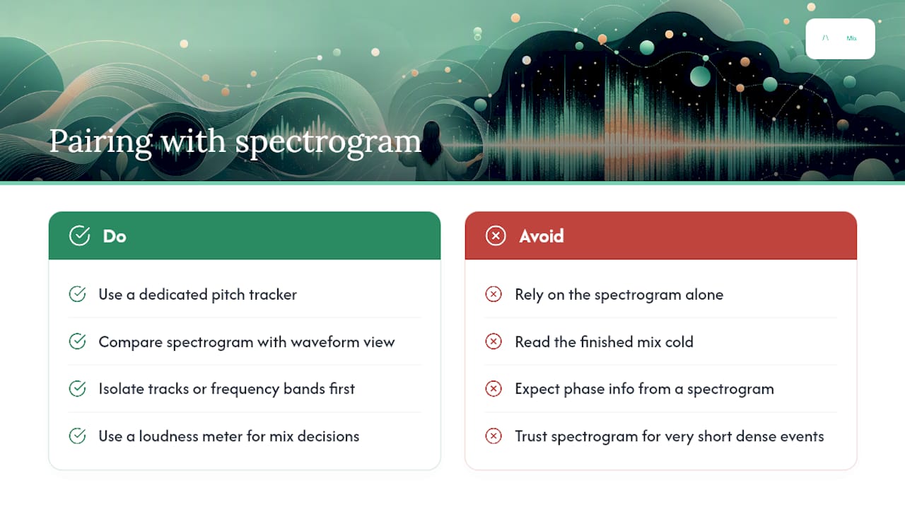
A spectrogram is a powerful diagnostic tool, but it was never meant to work alone, and treating it as the final word on any recording is where beginners go wrong. It shows you frequency and intensity over time, but it compresses phase information almost entirely, so two sounds that look identical on a spectrogram can behave very differently in a stereo mix or interact differently with room acoustics.
Pitch tracking fills one obvious gap: a dedicated pitch tracker gives you a single, precise line showing fundamental frequency over time, which is far easier to read at a glance than trying to eyeball the lowest harmonic band on a busy spectrogram, especially in noisy or overlapping material. The waveform view fills another. Amplitude spikes that confirm a plosive burst or a click are often clearer on a waveform than on the spectrogram itself, and comparing the two side by side is exactly the verification step any careful reading routine should include.
Spectrograms also struggle with very short events and very dense mixes simultaneously. A drum fill packed with overlapping cymbal hits, snare hits, and vocal ad libs can turn into visual soup, no amount of colour map tweaking will fully untangle it. In cases like that, isolating individual tracks or frequency bands before analysis, rather than trying to read the finished mix cold, gets you a far more reliable answer. The honest takeaway is that a spectrogram earns its place as one tool among several, alongside waveform inspection, pitch tracking, and, for mix decisions, a loudness meter, not as a single instrument that replaces the rest.
From guessing to confident reading: how novices actually improve
Most people who pick up spectrogram reading go through the same rough arc: total guesswork for the first few sessions, followed by a slow click of recognition once a handful of shapes, formants, hiss, hum, start repeating across different recordings. The jump from "guessing" to "confident" rarely comes from reading more theory. It comes from labelling enough real examples that the shapes stop feeling arbitrary.
If you're just starting out, don't skip the boring bit: run the same clip through the routine two or three times, once cold, once after listening, once after checking the waveform. Keep a before-and-after pair of spectrograms from your own practice sessions. Watching your own labelling accuracy improve over a fortnight is more motivating than any amount of theory, and it's the clearest evidence you'll get that the method works.
— AubioMix
AubioMix as an optional route: fast, repeatable visual feedback for your own mixes
Once you've trained your eye on formants and fricatives, the next natural step for a producer is turning that skill on your own tracks, and that's a slower process than most people expect when done entirely by eye. AubioMix takes the manual reading routine and automates it: upload a mix and you get a visual report covering frequency balance, masking, loudness, and more than a dozen other mixing and mastering checks, alongside plain-written, actionable fixes rather than just a picture to interpret yourself.
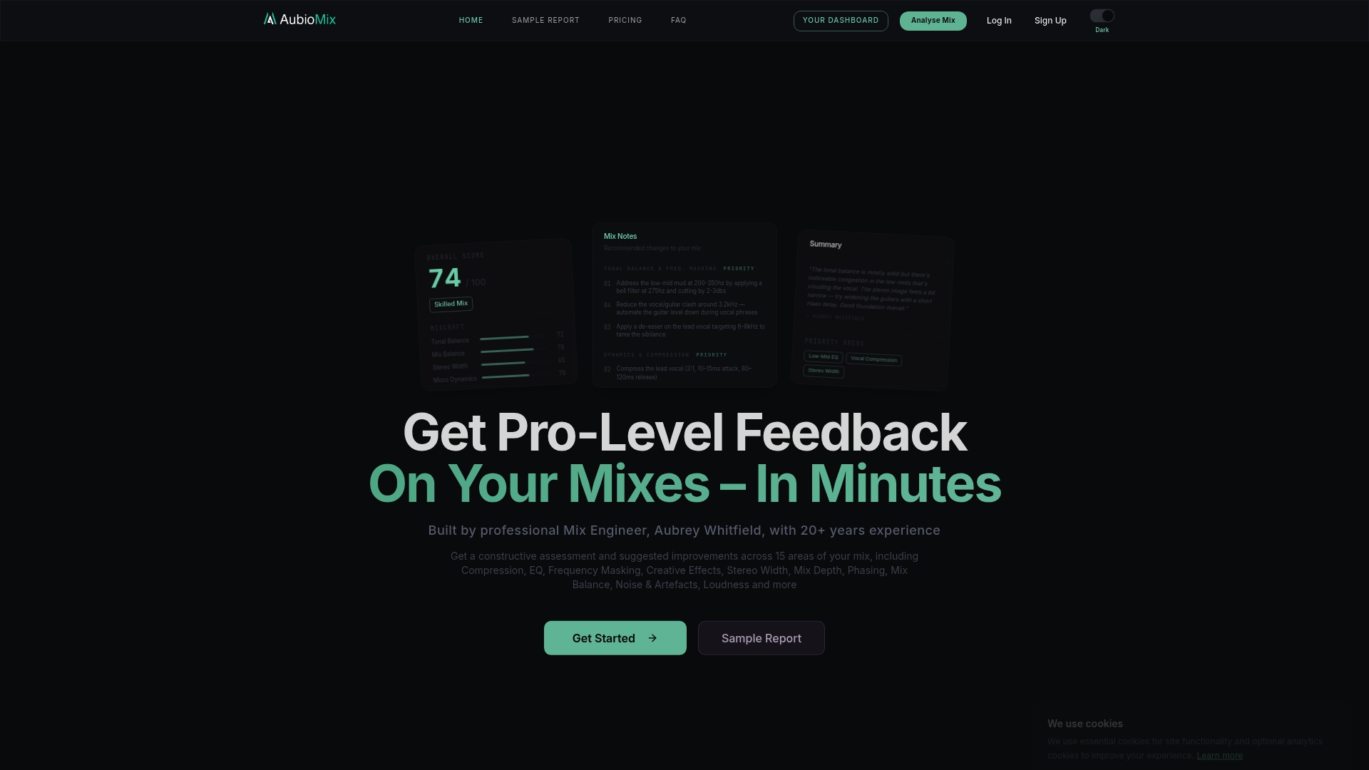
Manual spectrogram reading is genuinely valuable for building phonetic or critical-listening skill, it's how you learn to hear the difference between a harsh 3 kHz spike and a genuine vocal presence boost. But when you need a fast, objective second opinion on a finished mix rather than another hour of squinting at colour bands, an automated report gets you there in minutes instead. Browse a real example on the techno benchmark report to see what a full spectrogram-backed analysis looks like in practice, or head straight to AubioMix to upload your own mix and get feedback the same way.
Sources
- Spectrogram — IEEE Technav
- How to read a spectrogram — Rob Hagiwara (university notes)
- Understanding spectrograms — iZotope
- Spectrogram — Wikipedia
- How to read sound spectrogram — SoundCy